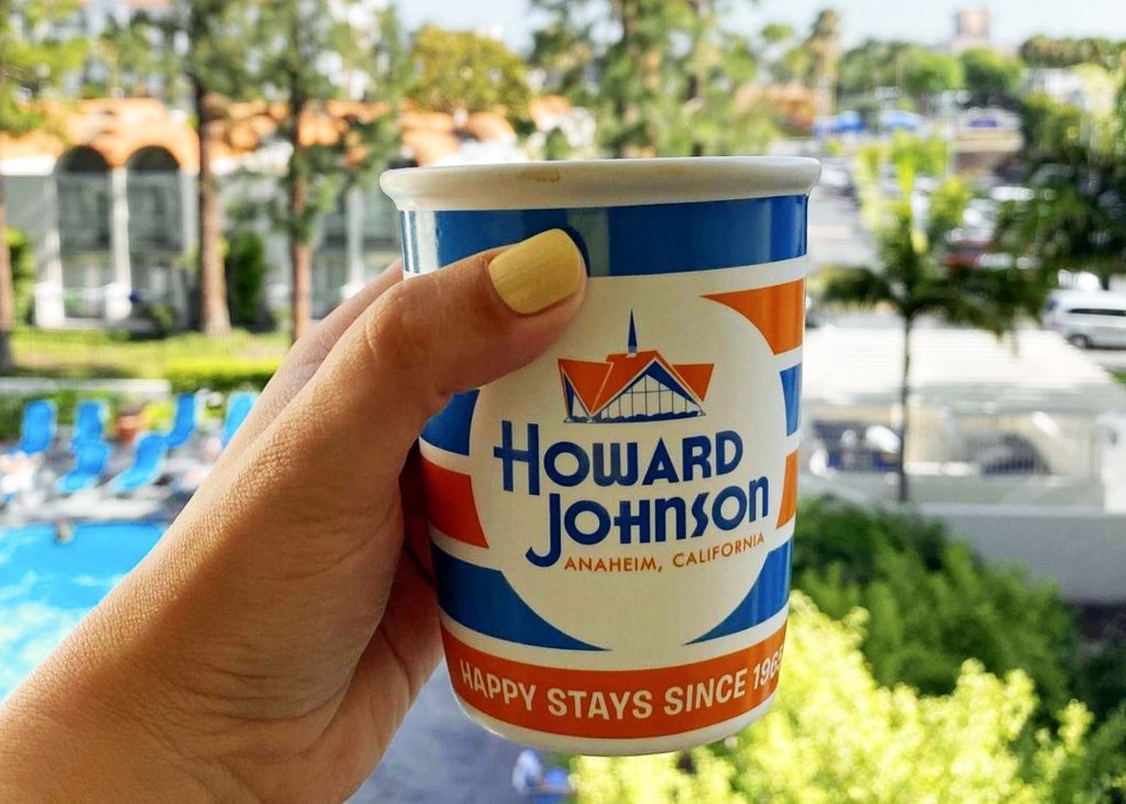
Howard Johnson is a legendary American hotel chain also known for its iconic logo. It features two prominent colors: deep turquoise blue and orange (a favorite color of legendary singers Prince and Frank Sinatra). These colors are carefully selected to create a distinctive and recognizable brand identity for customers. The story behind the logo is fascinating, so let’s explore the meaning of these two colors and why they were chosen for the Howard Johnson logo.
Deep turquoise blue is a color that is often associated with calmness, serenity, and relaxation. It is a blend of blue and green and has been used for centuries to promote feelings of peace and tranquility. In the Howard Johnson logo, turquoise is used as the background color. This creates a sense of relaxation, which is perfect for a hotel that aims to provide guests with a comfortable and stress-free experience.
Orange is a bold and energetic color associated with enthusiasm, creativity, and happiness (Sinatra once said, “Orange is the happiest color”). It is a warm color that can evoke feelings of excitement and joy. The Howard Johnson logo uses orange for the company name and the iconic roofline. This creates a sense of vibrancy, perfect for a hotel that wants to create a lively and fun atmosphere.
The combination of turquoise and orange in the Howard Johnson logo complement each other, creating a harmonious balance between calmness and energy. This combination also helps to develop a sense of nostalgia for many people, as the Howard Johnson logo has been a familiar sight on highways and in cities across America since the 1950s. Whether you are a guest at one of our hotels or simply passing by one of our iconic signs on the highway, the colors of turquoise and orange in Howard Johnson’s logo are sure to catch your eye and leave a lasting impression.
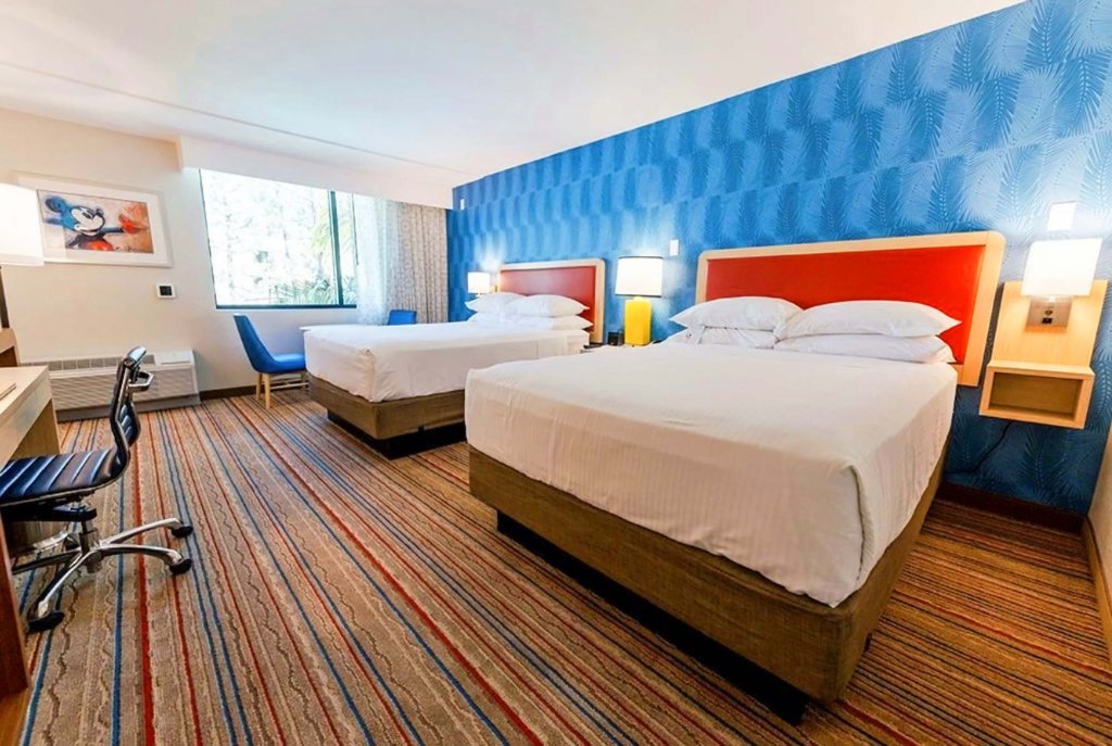
Turquoise and orange were carefully chosen to create a distinctive and recognizable brand identity. The calmness and relaxation of the deep turquoise blue and the sense of energy and vibrancy of the orange provide the ideal combination to create a unique and memorable visual identity. The colors of Howard Johnson are also whimsically represented within our décor at Howard Johnson Anaheim Hotel & Walter Playground.
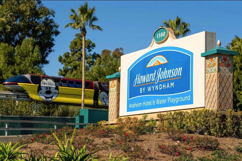
Although the once-popular Howard Johnson restaurants are closed, the hotel chain is obviously still alive and thriving. There are about 300 locations, and it’s currently owned by hotel giant Wyndham, with our location proudly standing as the flagship of the chain.